My Approach
A brand isn’t just a logo.
It isn’t a color palette.
And it’s definitely not just a tagline.
A brand is a promise — made visible.
At its best, a strong brand approach turns scattered ideas into a unified voice and transforms design into a powerful business tool.
With nearly 20 years of professional experience in marketing, design, and brand development — including more than a decade in marketing leadership — my approach to branding is grounded in both creative expertise and organizational insight.
At my studio, everything begins with listening. Before I design a single mark or choose a single color, I take time to understand your story, your goals, and what truly sets you apart. Because clarity always comes before creativity.
Every brand I build is rooted in three foundational pillars:
Clarity – Knowing exactly who you are, who you serve, and why it matters.
Consistency – Showing up cohesively across every touchpoint.
Connection – Creating emotional resonance that builds trust and long-term loyalty.
Strong brands communicate with confidence, evolve with intention, and feel unmistakably authentic. My role is to uncover what makes you distinct, refine it into a clear and compelling narrative, and translate that into a visual and verbal identity that works — beautifully and strategically.
A successful brand should do more than look polished.
It should:
Support growth
Attract the right audience
Empower your team
Create recognition and trust over time
Selected Brand Design
-
Studio U

-
Humboldt Development Partners

-
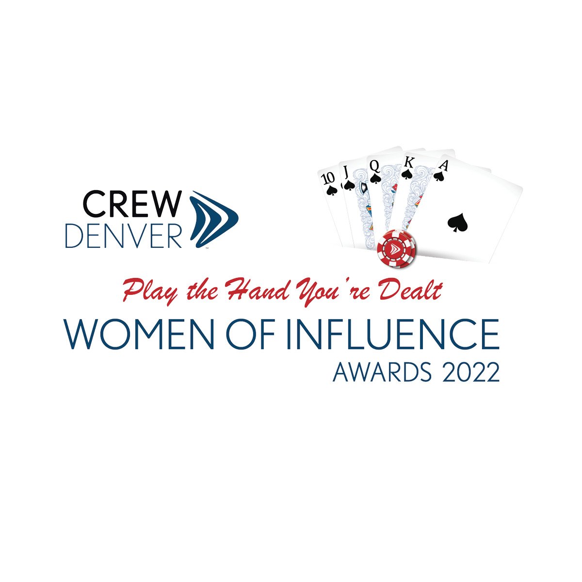
CREW Denver WOI

-
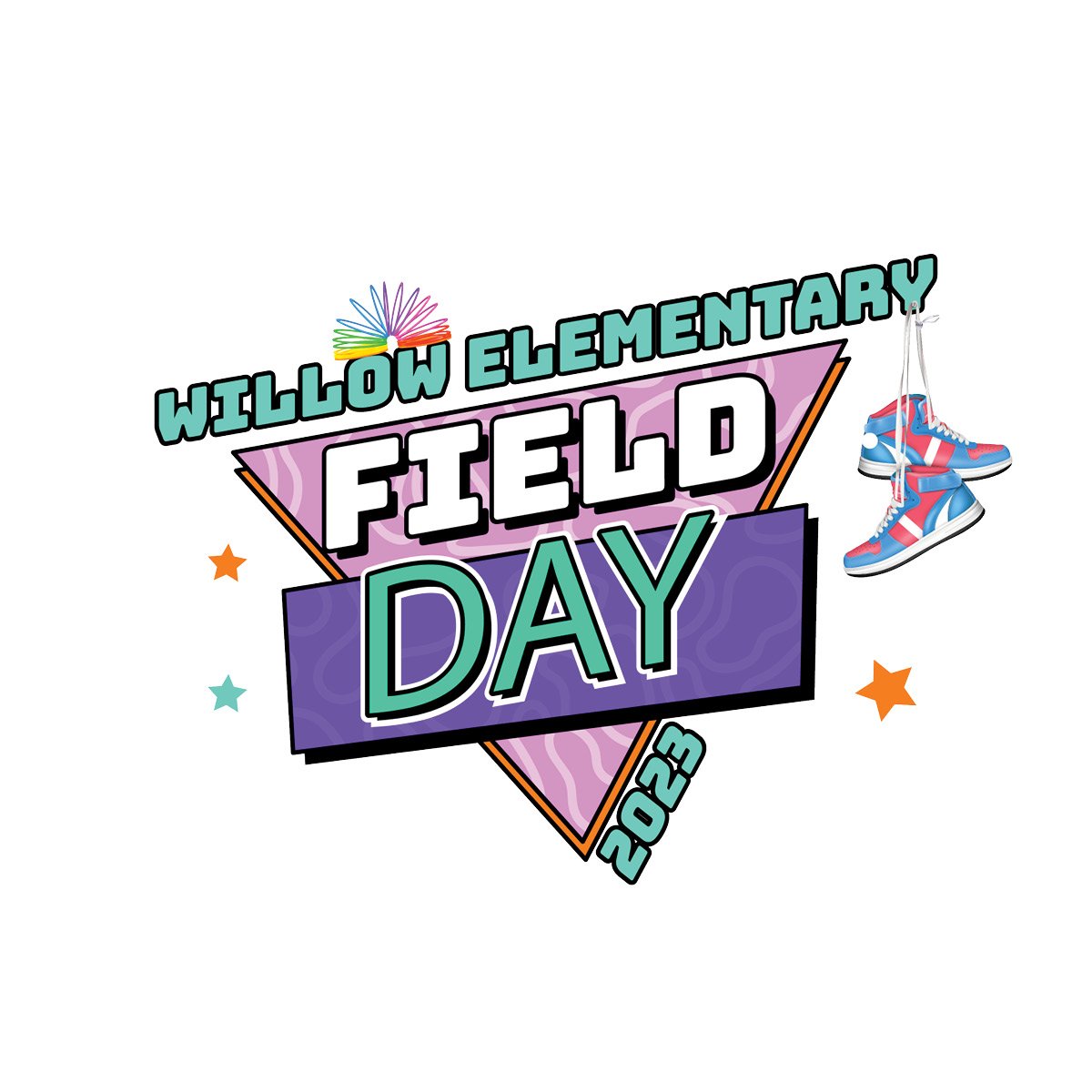
Willow Elementary Field Day & Auction

-
BUILT National Multi-Housing Summit

-
Ventura County Dental Hygienists' Association

-
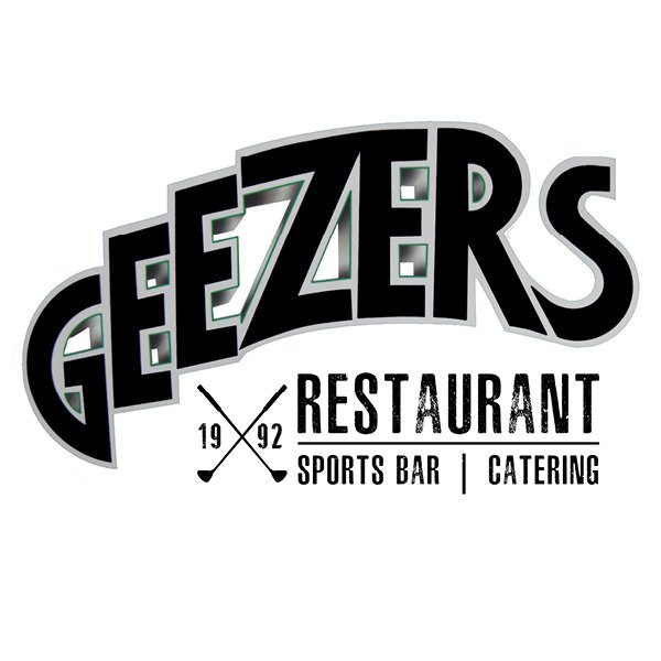
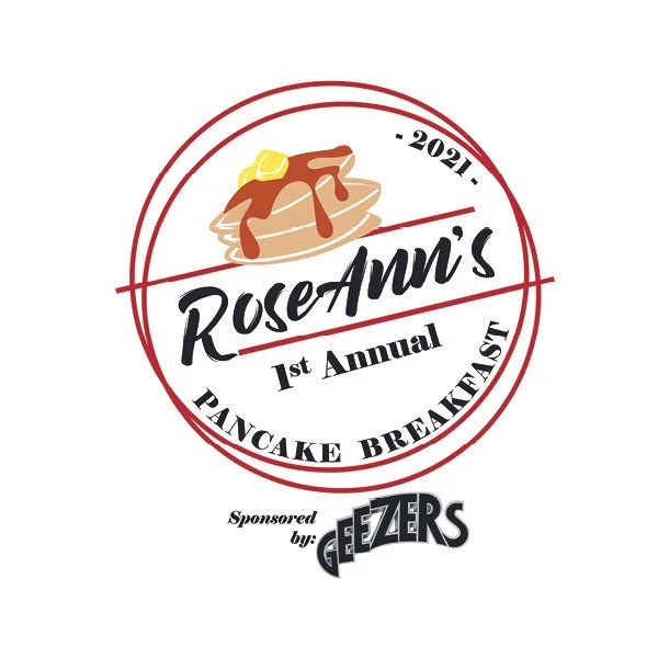
Geezers Restaurant

-
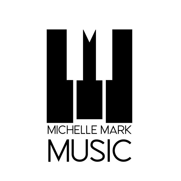
Michelle Mark Music

-
Kool Bodyworks
-
Fortify IT Services

-
Panther Program

-
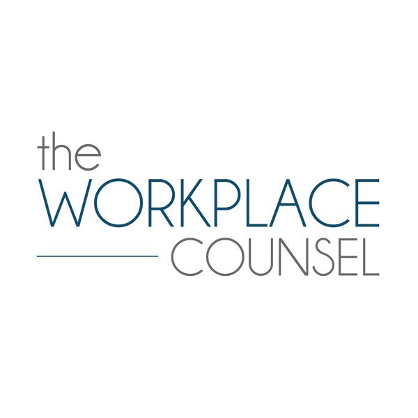
The Workplace Counsel

-
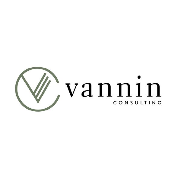
Vannin Consulting

-
Park Disability Law